13: Core Indicators and Patterns
Finding Direction in the Market
Standing before a price chart for the first time can feel rather like gazing upon the sea. To the untrained eye, the movement appears random, driven by countless unseen forces. Yet experienced sailors recognise patterns in the wind and tides, just as experienced traders learn to recognise recurring behaviour within financial markets.
Technical indicators were developed to help interpret this behaviour. They do not predict the future, nor do they eliminate uncertainty. Instead, they transform raw market data into meaningful information, allowing traders to assess trends, momentum and potential turning points with greater confidence.
Among the many indicators available today, a small number have stood the test of time. Moving averages, the Relative Strength Index (RSI) and the Moving Average Convergence Divergence (MACD) have become indispensable tools for traders across stocks, commodities, foreign exchange and cryptocurrency markets alike.
When combined with an understanding of chart patterns, these indicators provide a structured framework for analysing market behaviour.
Moving Averages
Perhaps no technical indicator is more widely used than the moving average.
Its purpose is elegantly simple: to smooth price fluctuations and reveal the underlying direction of the market.
Rather than examining every minor movement, the moving average calculates the average price over a specified period, producing a continuously updated line that filters out much of the market's day-to-day noise.
For traders, this provides a clearer picture of the prevailing trend.
Why Moving Averages Matter
Cryptocurrency markets are notoriously volatile.
Daily price swings of several percentage points are common, while shorter timeframes may display dramatic fluctuations within minutes.
Attempting to interpret every movement individually often leads to confusion.
Moving averages reduce this complexity by presenting the market's broader direction.
They help answer a fundamental question:
Is the market generally rising, falling or moving sideways?Although deceptively simple, this information forms the foundation of many trading strategies.
Types of Moving Averages
While numerous variations exist, two forms dominate technical analysis.
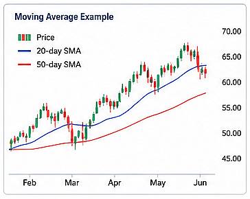
Simple Moving Average (SMA)
The Simple Moving Average calculates the arithmetic average of closing prices over a chosen period.
For example, a 20-day SMA adds together the closing prices of the previous twenty days and divides the result by twenty.
Each new trading session removes the oldest price while adding the newest, causing the average to move continuously.
Because every observation carries equal weight, the SMA produces a smooth representation of market direction.
It reacts relatively slowly to sudden price changes, making it particularly useful for identifying longer-term trends.
Exponential Moving Average (EMA)
The Exponential Moving Average follows the same general principle but assigns greater importance to recent prices.
This causes it to respond more quickly to changing market conditions.
Many active traders favour EMAs because they provide earlier signals when trends begin to strengthen or weaken.
The increased responsiveness, however, also makes the EMA more susceptible to short-term market noise.
Common Moving Average Periods
Different trading styles require different moving average lengths.
Some of the most frequently used include:
| Moving Average | Typical Purpose |
| 10-period | Very short-term momentum |
| 20-period | Short-term trend |
| 50-period | Intermediate trend |
| 100-period | Medium-term market direction |
| 200-period | Long-term trend |
Among these, the 200-day moving average has acquired particular significance.
Many institutional investors regard it as a dividing line between long-term bullish and bearish conditions.
When prices remain above the 200-day average, markets are generally considered healthy.
When prices fall below it, sentiment often becomes considerably more cautious.
Using Moving Averages
Moving averages serve several practical purposes.
Identifying Trends
Perhaps their most obvious function is trend identification.
When price consistently remains above a moving average, the market often exhibits bullish characteristics.
Conversely, persistent trading below the moving average may indicate a bearish trend.
Rather than reacting to every short-term fluctuation, traders use moving averages to maintain focus on the broader direction.
Dynamic Support and Resistance
Unlike horizontal support and resistance levels, moving averages change continuously as new data becomes available.
As a result, they often act as dynamic support during rising markets and dynamic resistance during declining markets.
Prices frequently pause or reverse after approaching widely observed moving averages.
This behaviour reflects the collective actions of traders monitoring the same indicator.
Moving Average Crossovers
One of the best-known trading techniques involves comparing two moving averages of different lengths.
When a shorter moving average crosses above a longer one, it may indicate strengthening bullish momentum.
When the shorter average crosses below the longer one, weakening momentum may be developing.
Two famous crossover signals have become part of trading vocabulary:
- Golden Cross — the 50-day moving average rises above the 200-day moving average, often signalling the beginning of a long-term upward trend.
- Death Cross — the 50-day moving average falls below the 200-day moving average, potentially indicating prolonged weakness.
These signals should never be interpreted in isolation but rather alongside broader market analysis.
Relative Strength Index (RSI)
While moving averages focus upon trend, the Relative Strength Index measures momentum.
Developed by J. Welles Wilder in 1978, the RSI seeks to determine whether buying or selling pressure has become unusually strong.
Unlike moving averages, which follow price directly, the RSI is an oscillator, moving between fixed values of 0 and 100.
This makes it particularly useful for identifying periods when markets may have moved too far, too quickly.
Understanding RSI Values
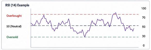
The RSI is commonly interpreted using three important zones.
Above 70
An RSI above 70 suggests that buying activity has been exceptionally strong.
Such conditions are often described as overbought. It may be a good opportunity to sell.
But this does not necessarily mean prices will immediately fall.
Strong markets can remain overbought for extended periods.
Instead, it indicates that traders should become increasingly attentive to signs of weakening momentum.
Below 30
An RSI below 30 indicates unusually heavy selling pressure.
Markets in this region are commonly described as oversold. It may be a good opportunity to buy.
But again, this does not guarantee an imminent recovery.
Rather, it suggests that selling may have become excessive and that a rebound is becoming more likely.
Around 50
The midpoint near 50 often represents equilibrium between buyers and sellers.
Markets fluctuating around this level generally lack strong directional momentum. Not the best moment to buy or sell.
Using RSI in Practice
RSI is particularly valuable when combined with price action.
For example:
- Rising prices accompanied by rising RSI often reinforce bullish momentum
- Falling prices alongside declining RSI confirm bearish conditions
- Divergences between price and RSI may signal weakening trends
Although divergences can provide valuable early warnings, they should always be confirmed by additional evidence.
Moving Average Convergence Divergence (MACD)
The Moving Average Convergence Divergence, more commonly known as MACD, combines trend analysis with momentum measurement.
Developed by Gerald Appel during the 1970s, it has become one of the most widely respected indicators in technical analysis.
Unlike the RSI, which oscillates between fixed limits, MACD fluctuates above and below zero.
Its purpose is to identify changes in trend strength before they become fully apparent on the price chart.
Components of MACD
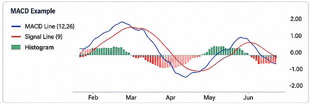
The indicator consists of three elements.
MACD Line
The MACD line measures the difference between two exponential moving averages, typically the 12-period and 26-period EMAs.
This line reflects changing market momentum.
Signal Line
A second moving average, usually calculated over nine periods, creates the signal line.
When the MACD crosses above the signal line, bullish momentum may be strengthening.
When it crosses below, bearish momentum may be increasing.
Histogram
The histogram displays the distance between the MACD line and the signal line.
Expanding histogram bars often indicate increasing momentum.
Shrinking bars suggest that momentum is fading.
For many traders, the histogram provides the earliest visual indication that market conditions are changing.
Strengths and Limitations of MACD
MACD performs particularly well in trending markets.
It helps traders:
- Confirm trend direction
- Measure momentum
- Identify possible reversals
- Detect changes in buying and selling pressure
Like all indicators, however, MACD can generate false signals during sideways markets where prices fluctuate within narrow ranges.
Chart Patterns
Long before computers transformed financial markets, traders observed that prices often formed recognisable shapes.
These recurring formations became known as chart patterns.
Although no pattern guarantees a particular outcome, many reflect recurring aspects of human psychology.
Fear, optimism, hesitation and confidence often produce remarkably similar market structures across different generations and asset classes.
Reversal Patterns
Reversal patterns suggest that an existing trend may be approaching its conclusion.
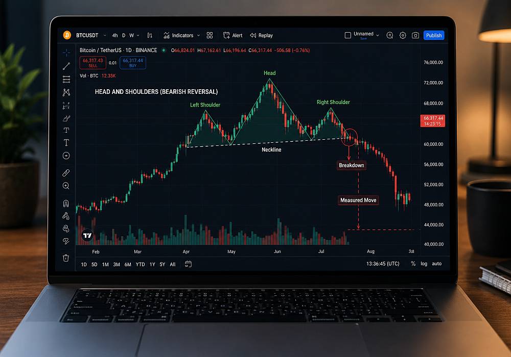
Head and Shoulders
One of the best-known reversal patterns is the Head and Shoulders.
It consists of:
- A left shoulder
- A higher central peak (the head)
- A right shoulder similar in height to the first
When the neckline supporting the pattern breaks, many traders interpret it as evidence that bullish momentum has weakened.
An inverted version appears near market bottoms and may indicate a bullish reversal.
Double Top
The Double Top develops when prices reach a similar high on two occasions before declining.
It suggests that buyers have repeatedly failed to overcome resistance.
Many traders interpret this as a potential bearish signal.
Double Bottom
The Double Bottom represents the opposite situation.
After testing a support level twice, buyers successfully prevent further declines.
This pattern often precedes renewed upward movement.
Continuation Patterns
Continuation patterns indicate temporary pauses within an existing trend.
Rather than signalling reversals, they suggest that the prevailing trend may eventually resume.
Triangles
Triangles develop as price movements become progressively narrower.
Three common variations exist:
- Ascending triangles
- Descending triangles
- Symmetrical triangles
These formations frequently precede significant breakouts as market indecision eventually resolves.
Flags
Flags appear following strong directional movements.
Prices consolidate briefly within a narrow channel before often continuing in the direction of the original trend.
Because they resemble flags attached to flagpoles, they are easily recognised by experienced traders.
Pennants
Pennants resemble small symmetrical triangles that form after rapid price movements.
Like flags, they frequently indicate temporary consolidation before continuation.
Combining Indicators and Patterns
Perhaps the greatest mistake made by inexperienced traders is relying upon a single indicator.
Markets are far too complex for any individual tool to provide complete certainty.
Instead, experienced analysts combine multiple forms of evidence.
For example, a trader may observe:
- An upward trend confirmed by moving averages
- RSI indicating healthy momentum without being overbought
- MACD producing a bullish crossover
- A breakout from an ascending triangle
While none of these signals alone guarantees success, their combined appearance may increase confidence in the overall analysis.
Conversely, conflicting indicators encourage caution and further observation.
Technical analysis is most effective when viewed as a process of building evidence rather than seeking absolute certainty.
Reading the Market with Perspective
Technical indicators and chart patterns are among the most valuable tools available to traders, yet they should never be mistaken for crystal balls. Moving averages reveal the market's underlying direction, RSI measures the strength of buying and selling pressure, and MACD highlights changes in momentum that may otherwise go unnoticed. Chart patterns, meanwhile, provide visual clues about the ongoing contest between optimism and caution.
Used thoughtfully, these tools transform seemingly chaotic price movements into a coherent narrative. They encourage patience, discipline and objective analysis rather than impulsive decision-making.
Ultimately, successful technical analysis is not about finding one perfect indicator. It is about combining multiple sources of information, understanding their strengths and limitations, and applying them within a sound framework of risk management. In the ever-changing landscape of cryptocurrency markets, such balanced judgement is often a trader's greatest advantage.
The fundamental question that technical analysis seeks to answer is:
When is the probability of a successful buy or sell at its highest?Technical analysis does not tell you when you must buy or sell. Instead, it helps you assess whether market conditions are favourable, allowing you to make decisions based on probability rather than certainty.